If you are an avid Instagrammer or Tik Toker I’m sure you have come across the videos of colour draping and the concept of colour analysis. It has become BIG! It had a huge moment in the ‘80’s but has now made a comeback. Colour draping and colour analysis is all about understanding the tints, tones and shades of colours that suit you and why.
Colour has the ability to impact how we think, feel and behave without us even realising. Subconsciously we react to different colours but consciously you might not even know. There is a real science to colour draping so I would really advise working with a professional Image Consultant or Personal Stylist that is trained in colour analysis and colour theory to ensure you are analysed correctly.
When we wear colour it reflects on to our face and can affect how we physically look but also how we feel too. Certain colours may cause dark shadows on the face or enhance fine lines and wrinkles or make you look pale or unwell while other colours may brighten your face, smooth out your complexion and act as a natural form of make up! Colours also have the ability to impact our hormones and so impact our mood and emotions. There is a real fascinating science behind colour analysis and I love to see the topic become more popular.
Colour Analysis in Practice
Learning your colours through colour analysis can truly be life changing. But once you know your colours how do you start adding colour into your wardrobe?
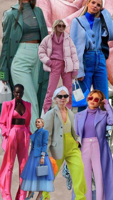
I’ve got 4 ways in which to use colour in your outfits plus some other tips for those that want a more subtle approach. For these we’ll be using the colour wheel to understand the combinations.
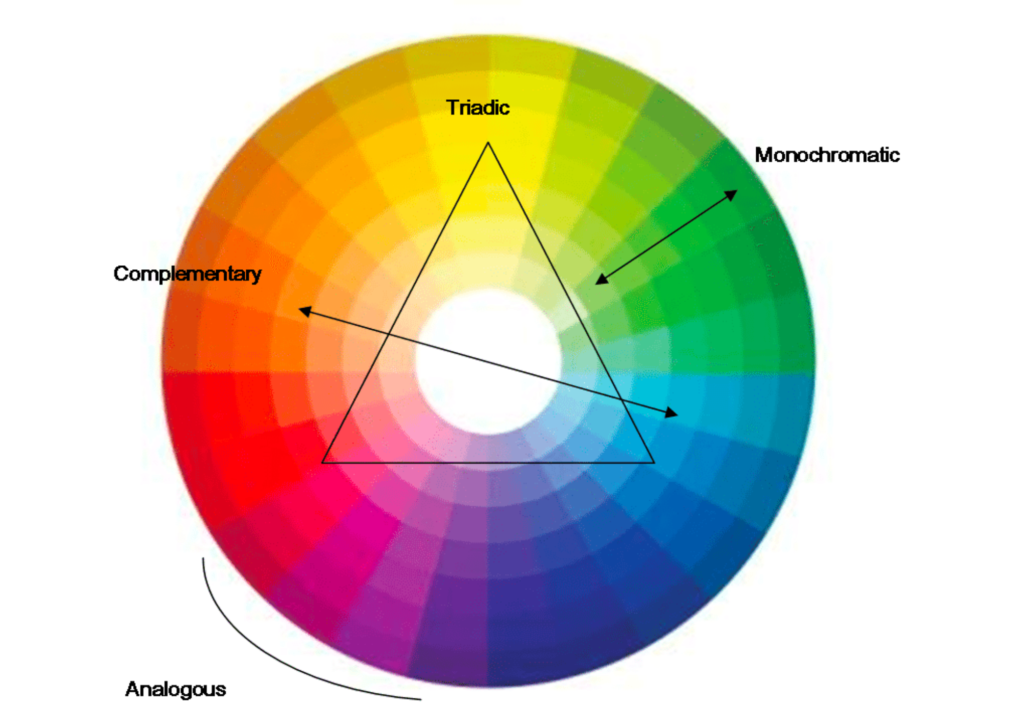
1. Monochrome – All one colour
One of the chicest ways of wearing colour is a monochrome look. And no I don’t mean just white and black. Choose a colour you love and mix and match your entire outfit in that one colour. For example, on the bottom you could wear a pair of blue jeans, on top you may wear a dark blue coloured top (a colour that is within your seasonal colour palette as it’s closest to your face). You may then layer with a lighter shade of blue in a blazer or jacket. Finally you mix and match with further accessories in differing shades of blue like in your bag and jewellery. This way of using colour is really easy on the eye, can lengthen a more petite frame and visually looks really appealing!
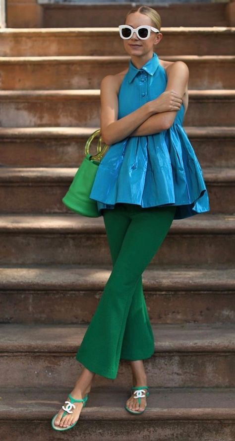
2. Analogous – Colours that sit next to each other
Think about blue and green. They sit next to each other on the colour wheel and so are easy on they eye and make the perfect combo. Similar options could be yellow and orange or purple and pink. They are more eye catching than a monochrome look but the colours are easy on the eye and don’t show a high level of contrast. If you want to inject colour but in a safer way, this can be an easier palette to try.
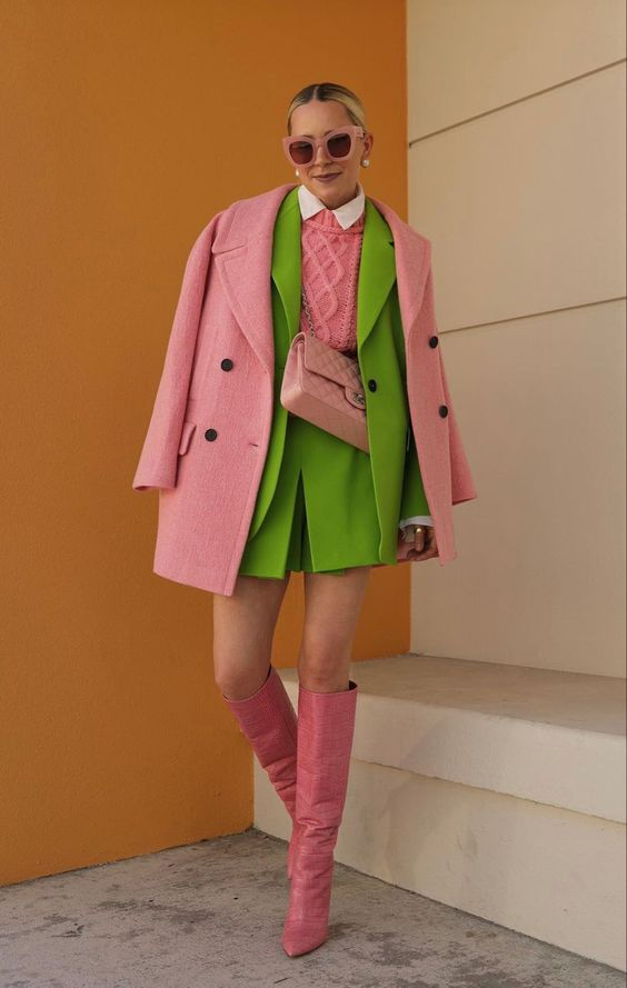
3. Complementary – 2 colours that sit opposite each other
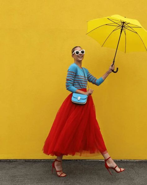
Looking to create more drama? Complementary colours sit opposite each other on the colour wheel and create a contrast. Wearing contrasting colours can have a high visual impact and really grab attention.
Some of my favourite combinations are pink and green, and orange with blue.
4. Triadic – 3 colours that sit in a triangle
For the ultimate statement pick three colours that sit in a triangle on the colour wheel which create a really high level of contrast and drama. The high contrast levels create an edgier look in your outfit. Not for the faint hearted, this will be sure to give you all of the colourful vibes and mood boosting energy!
And if the thought of wearing a full outfit of colour scares you, remember there are other ways to wear colour too.
It could be through make up, accessories; like bags, scarves, jewellery and belts or your nail colour! Colour can also work through prints too. So if you don’t want to colour block, think about adding colours through the prints you wear and mixing with neutrals.
Colour is truly fascinating and one of my favourite topics to teach. As an introduction I would highly recommend How Not To Wear Black by Jules Standish who talks all about why black may not always be the best colour and why colour analysis is so useful. My Colour and Style parties have become really popular this year so if you are interested in finding out more, book in for a FREE Style Call and lets talk all things colour!